

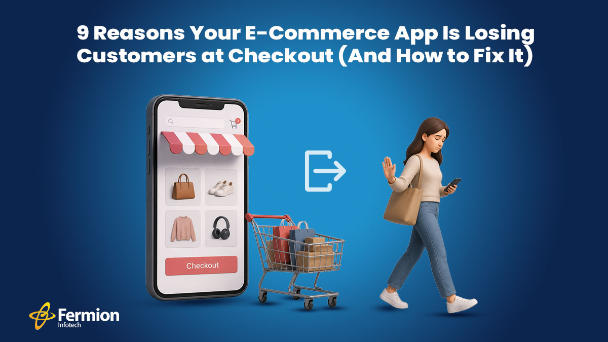
You’ve done everything right. Your ads are converting. Your product pages are beautiful. Your reviews are glowing. And yet — customers are vanishing at the finish line. Cart abandonment hovers around **70% across the e-commerce industry**. That means for every 10 people who add something to their cart, 7 leave without buying. The checkout page is where trust, patience, and desire all converge — and where the smallest friction can cost you the sale.
We have identified the nine most common reasons your checkout is leaking revenue, and exactly what to do about each one.
1. Forced Account Creation
You’ve spent money getting a customer to your app. They’ve found what they want. They’re ready to pay. Then you hit them with: “Create an account to continue.”
That’s a hard stop. Customers don’t want a relationship with your brand right now — they want a product. Forced registration adds time, creates password fatigue, and signals that you care more about your CRM than their time. Studies consistently show this is the single biggest reason for checkout abandonment.
How to fix it:
- Offer guest checkout as the default — not buried under a “Continue as guest” link in small text.
- After the purchase is complete, then invite them to save their details with a single click.
- Allow social login (Google, Apple) so returning users don’t need to remember a password.
- If accounts are essential for your business model, explain the benefit clearly: “Save your order history and get a faster checkout next time.”
The rule is simple: never make registration a prerequisite to payment.
2. Hidden Fees Revealed at the Last Step
A customer sees a ₹999 product, adds it to cart, goes through the entire checkout process, and then sees ₹999 + ₹149 shipping + ₹89 handling + ₹112 GST = ₹1,349 at the final screen. That’s not a checkout — that’s a bait and switch.
Price shock at the end destroys trust instantly. Even if the final price is fair, the feeling of being misled is enough to make someone close the app and buy elsewhere — often from a competitor who shows the same total but was upfront about it.
How to fix it:
- Show a price breakdown on the product page — or at least at the cart stage — before entering checkout.
- Display shipping cost estimates based on location as early as possible. Even a range (“₹99–₹149 shipping”) is better than silence.
- If you offer free shipping above a threshold, show a progress bar: “Add ₹200 more for free delivery.”
- Make your tax and fee structure transparent. Customers don’t mind paying taxes — they mind surprises.
Transparency isn’t just good ethics — it’s good business. Customers who know the real price upfront have already made the mental purchase before they reach checkout.
3. Too Many Steps and Form Fields
The average checkout asks for 15 to 20 form fields. Name, email, phone, address line 1, address line 2, city, state, pin code, country, card number, expiry, CVV, billing address, shipping address — and so on. Each field is micro-decision, and micro-decisions cause fatigue.
On mobile — where more than 75–77% of e-commerce traffic now originates — typing through a 20-field form is genuinely painful. Small keyboards, autocorrect errors, and switching between numeric and alphabetic inputs all add up to a frustrating experience.
How to fix it:
- Audit every field ruthlessly. Do you really need a phone number? A second address line? A fax number? Cut anything that isn’t essential to fulfillment.
- Use address autocomplete (Google Places API or similar) so users type three characters and pick their address from a dropdown.
- Enable autofill properly. Use correct HTML autocomplete attributes (autocomplete=”email”, autocomplete=”cc-number”, etc.) so browsers and password managers can fill in forms instantly.
- Offer one-page checkout or a clearly indicated 2-step flow. If you must use multiple steps, show a progress indicator so users know how close they are to done.
- For repeat customers, pre-fill saved details and let them confirm with a single tap.
The goal is to get from “I want this” to “payment confirmed” in under 60 seconds.
4. Slow Page Load Speed
Every extra second your checkout page takes to load costs you sales — measurably. Research from Google shows that a 1-second delay in mobile page load can reduce conversions by up to 20%. At 3 seconds, a significant portion of users abandon entirely.
Checkout pages are often the most JavaScript-heavy pages in an e-commerce app — payment SDKs, fraud detection scripts, analytics, A/B testing tools, and live chat widgets all load simultaneously. The result is a sluggish experience precisely when you need it to be instant.
How to fix it:
- Audit your third-party scripts. Load payment and fraud scripts asynchronously and defer everything else until after the core checkout UI has rendered.
- Use lazy loading for non-critical elements (upsell widgets, chat buttons) so they don’t block the page.
- Enable server-side rendering or static generation for checkout page shells, so the initial paint is fast.
- Compress images, use CDN delivery, and implement HTTP/2.
- Measure with Core Web Vitals — specifically LCP (Largest Contentful Paint) and FID (First Input Delay) — and set performance budgets your team must maintain.
A fast checkout isn’t a luxury — it’s a baseline expectation, especially on mobile networks.
5. Too Few Payment Options
The Indian e-commerce market is one of the most payment-method-diverse in the world. A significant portion of your customers want to pay via UPI. Others prefer EMI on their credit card. Some want to use their Paytm or PhonePe wallet. A growing segment expects Buy Now Pay Later options. And international customers need support for cards and PayPal.
If your checkout offers only credit and debit cards, you’re turning away a large and growing share of potential buyers — not because they don’t want your product, but because you don’t accept their money.
How to fix it:
- Integrate a full-stack payment gateway (Razorpay, PayU, Cashfree, or Stripe for international) that supports UPI, net banking, wallets, EMI, and cards in one integration.
- Display payment method icons prominently so customers can immediately see their preferred option is available — this alone reduces anxiety.
- Offer BNPL options (LazyPay, ZestMoney, Simpl) especially for higher average order values.
- For repeat customers, enable one-click payment by saving their preferred method securely.
- Test your payment flow on actual devices and networks — not just in a browser on a fast connection.
Every payment method you add is a segment of customers you’re no longer losing.
6. Lack of Trust Signals
Entering payment details is an act of trust. Customers are handing over sensitive financial information to a brand — and at the moment of checkout, any doubt about security can make them hesitate. A missing padlock icon, an unfamiliar brand name, no visible return policy, or a checkout page that looks different from the rest of your app are all red flags that trigger subconscious alarm.
First-time buyers are especially sensitive to this. They’re asking: “Is this site legitimate? Will I actually get my product? Can I return it if something’s wrong?”
How to fix it:
- Display SSL/security badges visibly (Norton, McAfee, or even a simple padlock with “Secure checkout” text).
- Show your return and refund policy inline on the checkout page — a single sentence with a link is enough.
- Add customer review snippets or star ratings near the checkout button for the product being purchased.
- Display recognisable payment logos (Visa, Mastercard, UPI, RuPay) — signal legitimacy.
- If you’re a newer brand, include a money-back guarantee prominently. It removes the perceived risk of the first purchase.
- Ensure your checkout page branding is consistent with the rest of your app — same logo, same colors, same fonts.
Trust isn’t one big thing — it’s an accumulation of small signals that together say “you’re safe here.”
7. Poor Mobile Experience
More than 60% of e-commerce transactions are now initiated on mobile — and yet checkout flows are still largely designed on desktop and adapted downward. The result is tap targets too small for thumbs, keyboards that pop up at the wrong time, buttons that fall below the fold, and payment fields that require pinching and zooming.
Mobile users are also more likely to be interrupted, on slower connections, and multitasking. A checkout flow that requires focused attention and precise interaction on a small screen will bleed users constantly.
How to fix it:
- Design checkout mobile-first, not desktop-first.
- Use the correct keyboard types for each input — inputmode=”numeric” for card numbers and OTP fields, inputmode=”email” for email, type=”tel” for phone numbers. The right keyboard means fewer errors and faster input.
- Make all tap targets at least 44×44px — the minimum recommended by Apple and Google for comfortable tapping.
- Use sticky CTAs — keep the “Place order” or “Pay now” button visible without scrolling.
- Test real mid-range Android devices on a 4G connection, not just the latest iPhone on Wi-Fi. That’s where most of your users are.
- Integrate native payment sheets — Google Pay and Apple Pay with a single tap bypass the entire form for users who have these set up.
The mobile checkout experience is your checkout experience. Treat it accordingly.
8. No Cart Recovery Mechanism
Even a perfectly designed checkout will lose some users — life interrupts; price comparison happens; doubts arise. The difference between a good checkout strategy and a great one is what happens after someone leaves.
Without a cart recovery system, every abandoned checkout is a permanent loss. With one, a significant percentage of those users can be brought back.
How to fix it:
- Implement abandoned cart email sequences — a reminder at 1 hour, a follow-up at 24 hours, and a final nudge at 72 hours (optionally with a discount). Average recovery rates from email sequences range from 5% to 15%.
- Use push notifications for app users who’ve opted in — these have higher open rates than email.
- If the user has entered their email before abandoning, capture it — even partial checkout information is valuable for recovery.
- For logged-in users, persist the cart across sessions and devices. “Your cart is waiting” is one of the most effective re-engagement messages in e-commerce.
- Consider exit-intent overlays on web — a last-moment prompt (“Leave without your order? Here’s 10% off. Before the user navigates away.
Cart’s recovery doesn’t fix a broken checkout — but it’s an essential safety net that turns a portion of abandonment into revenue.
9. Vague or Unhelpful Error Messages
Payment failures happen — cards get declined; OTPs expire; network timeouts occur. How your checkout handles these moments is the difference between a user who tries again and a user who gives up.
“Payment failed. Please try again.” is not helpful. It doesn’t tell the user what went wrong, what they should do, or whether their money was charged. It creates anxiety, confusion, and often abandonment.
How to fix it:
- Write specific, actionable error messages: “Your card was declined. Please check your card details or try a different payment method” is far better than “Transaction failed.”
- Tell users whether they were charged — this is the question everyone asks after a failed payment. Proactively answer it.
- If a specific payment method is failing, suggest an alternative: “UPI payment timed out. Would you like to try net banking or a card instead?”
- For OTP issues, provide a visible resend timer and a clear path to request a new code.
- Log payment failure reasons internally and monitor them — a spike in a particular error code often signals a gateway issue you can proactively fix.
- Test your error states intentionally during QA. Most teams test the happy path; the error path is where users actually need you most.
Good error handling isn’t just UX polish — it’s a trust-builder. A checkout that handles problems gracefully makes customers confident enough to try again.
The Bottom Line
Start with the highest-impact fixes — guest checkout, fee transparency, and form simplification — and measure the change in your conversion rate before moving on. Even a 1% improvement in checkout conversion can mean a significant revenue uplift at scale.
We’ve had the privilege of working with some of India’s most recognised retail and lifestyle brands — including Ogaan, Godrej, Aashni & Co., India Circus, Nykaa, and several other leading e-commerce names — helping them build checkout experiences that convert. Across these engagements, we’ve worked across multiple tech stacks and platforms, so wherever you are in your build, we speak your language.
If you’re looking to build something similar — or fix a checkout that’s already losing you revenue — we’d love to hear from you.
Reach out at [email protected]